{
  const shares = cleanShares(shares_source, true)

  // Not the sidebar's `updated`, which is election-wide: a selected institute
  // may last have polled weeks before the newest poll. UTC as for `updated`.
  const shareDate = d3.max(shares_source, d => new Date(d.date))
  const shareDateLabel = shareDate
    ? shareDate.toLocaleDateString("de-DE", {
      day: "2-digit", month: "long", year: "numeric", timeZone: "UTC"
    })
    : updated

  const lastResults = cleanShares(cur.last_result_data.last_result || [], true)
  const lastByParty = Object.fromEntries(lastResults.map(d => [d.party, d.percent]))
  const comparison = shares.map((d, i) => ({
    ...d,
    index: i,
    last_percent: lastByParty[d.party],
    diff: Number.isFinite(lastByParty[d.party]) ? d.percent - lastByParty[d.party] : null
  }))
  const hasLastResult = comparison.some(d => Number.isFinite(d.last_percent))
  const maxY = Math.max(
    35,
    d3.max(comparison, d => Math.max(d.percent, Number.isFinite(d.last_percent) ? d.last_percent : 0)) + 7
  )
  const formatDiff = d =>
    d.diff == null
      ? ""
      : Math.abs(d.diff) < 0.05
      ? "±0%"
      : `${d.diff >= 0 ? "+" : ""}${formatDe(d.diff)}%`

  // The card holds 55% of the viewport height, so a fixed 360px chart left a
  // third of it empty on a tall screen and overflowed a short one. Take the
  // height from the viewport instead — less the header block over the plot and
  // the dashboard's own chrome — inside bounds that keep the bars readable
  // either way.
  const chartHeight = Math.max(300, Math.min(620,
    Math.round((window.innerHeight - 100) * 0.55) - 110))

  const buildPlot = rotateTicks => Plot.plot({
    title: `${institute_label} - ${shareDateLabel}`,
    subtitle: election_date_label,
    // without this the party names fall back to Plot's 10px default
    style: { fontSize: "13px" },
    // see the marginTop note on the Umfrageverlauf trend chart
    marginTop: 40,
    // tickRotate does not grow the margin, so the diagonal names would be cut
    // off at the frame; the value rows under them move down by the same amount
    marginBottom: rotateTicks
      ? (hasLastResult ? 110 : 80)
      : (hasLastResult ? 86 : 55),
    // no y-axis to leave room for, just enough that the leftmost bar does not
    // sit flush against the card edge
    marginLeft: 20,
    marginRight: 25,
    height: chartHeight,
    x: {
      label: null,
      domain: [0, comparison.length],
      ticks: comparison.map(d => d.index + 0.5),
      tickRotate: rotateTicks ? -45 : 0,
      tickFormat: d => comparison[Math.floor(d)]?.label || ""
    },
    // Axis dropped: every bar already carries its share as a label underneath,
    // so the ticks only repeated what the numbers say. The domain still sets how
    // the bars scale, and the 5% rule stays as the one reference line that is not
    // readable off the bars themselves.
    y: {
      axis: null,
      domain: [0, maxY]
    },
    marks: [
      // Grid without the axis it usually belongs to: unlabelled lines to compare
      // bar heights against, not values to read off. Every 5 points, from the
      // first one above the baseline that Plot.ruleY([0]) already draws, in the
      // same grey as the Koalitionen grid — and first in the marks, so the bars
      // sit on top of it.
      Plot.ruleY(d3.range(5, maxY, 5), {
        stroke: "#e5e7eb",
        strokeWidth: 1
      }),
      ...(hasLastResult ? [
        Plot.rectY(comparison.filter(d => Number.isFinite(d.last_percent)), {
          x1: d => d.index + 0.18,
          x2: d => d.index + 0.48,
          y1: 0,
          y2: "last_percent",
          fill: d => party_colors[d.party] || "#aaa",
          fillOpacity: 0.28,
          stroke: "#999",
          strokeWidth: 1,
          strokeOpacity: 0.45
        })
      ] : []),
      Plot.rectY(comparison, {
        x1: d => hasLastResult ? d.index + 0.48 : d.index + 0.22,
        x2: d => hasLastResult ? d.index + 0.78 : d.index + 0.78,
        y1: 0,
        y2: "percent",
        fill: d => party_colors[d.party] || "#aaa",
        fillOpacity: d => d.party === "fdp" ? 1 : 0.9,
        // the pale party colours have no edge of their own against the card
        stroke: "#999",
        strokeWidth: 1
      }),
      Plot.ruleY([5], {
        stroke: "#555",
        strokeDasharray: "4 3",
        strokeWidth: 1.2
      }),
      // Share and change are right-aligned to a common edge so their "%" signs
      // line up: same anchor, and a shared dx of half a label width to keep the
      // block centred under the bars. Centred when the value stands alone.
      // Once the names are on the diagonal the chart is narrow enough that these
      // two rows no longer fit either: at 12px they run into one another and read
      // as a single string of digits. They come down to 9px and give up the
      // right-aligned offset, sitting centred under their own band instead.
      Plot.text(comparison, {
        x: d => hasLastResult && !rotateTicks ? d.index + 0.48 : d.index + 0.5,
        y: 0,
        text: d => formatDe(d.percent) + "%",
        // heavier than the change below it: this is the headline number
        fill: "#333",
        fontSize: rotateTicks ? 9 : 12,
        fontWeight: 700,
        dy: rotateTicks ? 62 : 45,
        dx: hasLastResult && !rotateTicks ? 20 : 0,
        textAnchor: hasLastResult && !rotateTicks ? "end" : "middle"
      }),
      ...(hasLastResult ? [
        Plot.text(comparison, {
          x: d => rotateTicks ? d.index + 0.5 : d.index + 0.48,
          y: 0,
          text: formatDiff,
          fill: d => d.diff > 0 ? "#666" : d.diff < 0 ? "#999" : "#888",
          fontSize: rotateTicks ? 9 : 12,
          fontWeight: 500,
          dy: rotateTicks ? 78 : 61,
          dx: rotateTicks ? 0 : 20,
          textAnchor: rotateTicks ? "middle" : "end"
        })
      ] : []),
      Plot.ruleY([0])
    ]
  })

  // Whether the names fit side by side depends on the election: eight parties
  // leave each band about 74px, which "Freie Wähler" alone overruns. Rather than
  // guess at their width — these ticks are drawn in Plot's font, not the body's —
  // the chart is built flat, measured hidden, and rebuilt on the diagonal only if
  // its own labels came out wider than a band. The SVG is scaled to the card, so
  // measuring it at its natural width settles the question at every card width.
  const collides = plot => {
    const holder = html`<div class="card-body" style="
      position:absolute;
      top:0;
      left:-9999px;
      visibility:hidden;
    "></div>`
    holder.append(plot)
    document.body.append(holder)
    const svg = plot.tagName === "FIGURE" ? plot.querySelector("svg") : plot
    const widest = d3.max(
      svg.querySelectorAll('[aria-label="x-axis tick label"] text'),
      node => node.getComputedTextLength()
    ) ?? 0
    const band = ((+svg.getAttribute("width") || 640) - 45) / comparison.length
    holder.remove()
    return widest + 6 > band
  }

  const flat = buildPlot(false)
  const plot = collides(flat) ? buildPlot(true) : flat

  // The election this card is about, above the Umfragebasis line: the card
  // opens the Überblick tab, and the sidebar names the election only inside the
  // collapsed "Infos zur Wahl".
  return html`<div class="shares-header">
    <div style="
      margin:0 0 5px 0;
      color:#333;
      font-size:1.35rem;
      font-weight:700;
      line-height:1.25;
    ">${cur_meta.title}</div>
    ${plot}
  </div>`
}
{
const hoverProbability = probability =>
(probability * 100).toLocaleString("de-DE", {
minimumFractionDigits: 1,
maximumFractionDigits: 2
}) + "%"
// A value under 0,05% would print as "0,0%" beside a dot that is plainly
// there, so name it as the small number it is. The tooltip keeps the detail.
// The "<" is escaped: as a literal it ends the ojs chunk's parse right here.
const labelProbability = probability =>
probability > 0 && probability * 100 < 0.05
? "\u003C0,1%"
: formatDe(probability * 100) + "%"
const withProbabilityTooltip = (plot, rows, valueKey) => {
const wrapper = html`<div style="position:relative"></div>`
const tooltip = html`<div style="
position:absolute;
display:none;
pointer-events:none;
z-index:5;
padding:4px 7px;
border:1px solid #d1d5db;
border-radius:4px;
background:white;
color:#333;
font-size:12px;
font-weight:700;
box-shadow:0 2px 8px rgba(0,0,0,0.12);
white-space:nowrap;
"></div>`
wrapper.append(plot, tooltip)
const svg = plot.tagName === "FIGURE" ? plot.querySelector("svg") : plot
const xScale = plot.scale("x")
const yScale = plot.scale("y")
const active = rows
const overlay = d3.select(svg).append("g")
const show = (event, d) => {
const rect = wrapper.getBoundingClientRect()
tooltip.style.display = "block"
tooltip.style.left = `${event.clientX - rect.left + 10}px`
tooltip.style.top = `${event.clientY - rect.top - 30}px`
tooltip.textContent = `${d.label}: ${hoverProbability(d[valueKey])}`
}
const hide = () => { tooltip.style.display = "none" }
// One target per row rather than one per bar: the value sits past the end of
// its bar and has to be hoverable too. On the band scale the bars now use,
// `apply` gives the top of a row and `bandwidth` its height.
overlay.selectAll("rect").data(active).join("rect")
.attr("x", xScale.apply(0))
.attr("y", d => yScale.apply(d.label))
.attr("width", xScale.apply(1) - xScale.apply(0))
.attr("height", yScale.bandwidth)
.attr("fill", "transparent")
.style("pointer-events", "all")
.on("pointermove", show)
.on("pointerleave", hide)
return wrapper
}
// The card behind a leadership block. Drawn straight into the SVG rather than
// as a mark: it has to span two rows of a band scale and sit behind
// everything, including the names in the left margin.
const withGroupCards = (plot, rows) => {
const svg = plot.tagName === "FIGURE" ? plot.querySelector("svg") : plot
const yScale = plot.scale("y")
const blocks = Array.from(d3.group(rows, d => d.coalition_key).values())
.filter(block => block.length > 1)
if (!blocks.length) return plot
const pad = 5
const top = block => d3.min(block, d => yScale.apply(d.label)) - pad
d3.select(svg).insert("g", ":first-child")
.selectAll("rect").data(blocks).join("rect")
.attr("x", 6)
.attr("width", (+svg.getAttribute("width") || 0) - 12)
.attr("y", top)
.attr("height", block =>
d3.max(block, d => yScale.apply(d.label)) + yScale.bandwidth + pad - top(block))
.attr("rx", 6)
.attr("fill", "#eef0f3")
return plot
}
const maxRows = 5
const ranked = leading_variants
.filter(d => d.probability > 0)
.sort((a, b) =>
d3.descending(a.probability, b.probability) || d3.descending(a.vote_share, b.vote_share)
)
// The same parties under a different leader are one block: the flipped
// variant is drawn directly under its counterpart instead of wherever its own
// probability would rank it, and the two share a grey card. Blocks keep the
// ranking of their strongest variant, and a block is never split across the
// toggle — the first one that no longer fits sends it and everything weaker
// below, so the order stays monotone.
const blocks = Array.from(
d3.group(ranked, d => d.coalition_key).values(),
rows => rows.slice().sort((a, b) => d3.descending(a.probability, b.probability))
).sort((a, b) =>
d3.descending(a[0].probability, b[0].probability) ||
d3.descending(a[0].vote_share, b[0].vote_share)
)
const split = blocks.findIndex((block, i) =>
d3.sum(blocks.slice(0, i + 1), b => b.length) > maxRows
)
const shown = split < 0 ? blocks : blocks.slice(0, split)
const coal = shown.flat()
const remaining = (split < 0 ? [] : blocks.slice(split)).flat()
const plotHeading = (line1, line2 = null) => html`<div style="
margin:0 0 6px 0;
color:#555;
font-size:13px;
font-weight:600;
line-height:1.35;
min-height:35px;
">
<div>${line1}</div>
${line2 ? html`<div>${line2}</div>` : html`<div style="visibility:hidden"> </div>`}
</div>`
// Kept open across re-renders of this cell: the chart is built once as soon as
// its own data is there and again when the inputs it shares with the rest of
// the page settle, and switching the Umfragebasis rebuilds it too. A click in
// between built a new, closed box over the opened one, so the section appeared
// to snap shut on its own. sessionStorage, so the state lasts for the tab and
// no longer.
const plotInfo = (content, key) => {
const box = html`<details style="
margin:0 0 8px 0;
padding:7px 9px;
border:1px solid #d1d5db;
border-radius:6px;
background:#fafafa;
color:#666;
font-size:11px;
line-height:1.35;
">
<summary style="
cursor:pointer;
list-style:none;
display:inline-flex;
align-items:center;
gap:5px;
font-weight:600;
">
<span style="
display:inline-flex;
align-items:center;
justify-content:center;
width:13px;
height:13px;
border:1px solid #888;
border-radius:50%;
font-size:9px;
line-height:1;
">i</span>
<span>Was wird hier dargestellt?</span>
</summary>
<div style="margin:6px 0 0 18px;max-width:720px;color:#666;font-weight:400">
${content}
</div>
</details>`
const remember = open => {
try { sessionStorage.setItem(key, open ? "1" : "0") } catch (error) {}
}
try { box.open = sessionStorage.getItem(key) === "1" } catch (error) {}
// `toggle` fires in a task of its own, late enough for a rebuild to land
// between the click and it and read the old state back — so the click is
// recorded as it happens, with the state it is about to produce, and the
// toggle listener is left to cover any other way the box is opened.
box.querySelector("summary").addEventListener("click", () => remember(!box.open))
box.addEventListener("toggle", () => remember(box.open))
return box
}
const rowHeight = 42
// The names live in the left margin, so that margin has to hold the longest
// of them: at a fixed 155px the four-party labels were cut off at the card
// edge, and a canvas estimate of their width stayed a few pixels short —
// these ticks are not drawn in the body font the estimate assumed. So they
// are measured as the browser really draws them: a probe plot is mounted
// hidden, under the class the stylesheet keys the tick font off, and its own
// tick labels are read back. Both plots take the result, which is what keeps
// their bars aligned, and so does the toggle between them.
const axisMargin = (() => {
const rows = [...coal, ...remaining]
const probe = Plot.plot({
style: { fontSize: "13px" },
marginLeft: 300,
height: rows.length * 20 + 40,
x: { axis: null, domain: [0, 1] },
y: { label: null, domain: rows.map(d => d.label), tickSize: 0, tickPadding: 8 },
marks: [Plot.barX(rows, { y: "label", x: "probability" })]
})
const holder = html`<div class="overview-coalitions" style="
position:absolute;
top:0;
left:-9999px;
visibility:hidden;
"></div>`
holder.append(probe)
document.body.append(holder)
const widest = d3.max(
probe.querySelectorAll('[aria-label="y-axis tick label"] text'),
node => node.getComputedTextLength()
) ?? 0
holder.remove()
return Math.round(Math.min(300, Math.max(155, widest + 20)))
})()
// Both Überblick charts are drawn at this width, so their type ends up the
// same size: the card scales the SVG it is given, and one drawn wider than its
// card shrinks with everything on it — at Plot's default 640 this chart came
// out at 0.48 scale on a zoomed-in browser, its 13px labels down at 6px, next
// to a chart still at full size. Half the room beside the sidebar, floored so
// it stays legible on a phone.
const chartWidth = Math.max(320, (window.innerWidth - 310) / 2 - 30)
// Ticks every 25% need about 420px; below that they run into one another, so
// the axis falls back to 0/50/100 and the grid lines follow it.
const ticks = chartWidth < 420 ? [0, 0.5, 1] : [0, 0.25, 0.5, 0.75, 1]
// Half the chart at most goes to the names: on a narrow card the full label
// margin left the bars almost no room.
const labelMargin = Math.min(axisMargin, Math.round(chartWidth * 0.5))
// A bar of a few tenths of a percent comes out thinner than its own outline,
// so all that is left of it is the grey stroke — a stray mark hanging off the
// axis next to the row. Below the width at which the fill itself shows, the
// row is left to its value label alone.
const minVisibleProbability = 2 / Math.max(1, chartWidth - labelMargin - 65)
const coalitionPlot = (rows, title = null) => {
const plot = Plot.plot({
...(title ? { title } : {}),
style: { fontSize: "13px" },
marginLeft: labelMargin,
marginRight: 65,
// Plot keeps the x-axis label at the bottom edge of the margin, so the gap
// to the ticks is marginBottom minus tick height: at the default 30 the
// label overlapped "100%".
marginBottom: 48,
// A fixed height per row, not a floor on the whole chart: the "Weitere
// Koalitionen" plot has fewer rows, and a floor would have stretched its
// bars thicker than the ones above the toggle.
marginTop: 20,
height: rows.length * rowHeight + 68,
width: chartWidth,
x: {
label: "Mehrheitswahrscheinlichkeit",
domain: [0, 1],
ticks,
tickFormat: d => formatDe(d * 100, 0) + "%"
},
y: {
label: null,
// already in display order, strongest block first, each block's variants
// together
domain: rows.map(d => d.label),
tickSize: 0,
tickPadding: 8,
// A band scale now that the rows are bars. The outer padding is set apart
// from the inner one so that it does not grow with the number of rows:
// that keeps the step at exactly rowHeight, hence the bars in both plots
// the same thickness.
paddingInner: 0.3,
paddingOuter: 0.15
},
marks: [
Plot.ruleX([0], { stroke: "#aaa" }),
Plot.ruleX(ticks.slice(1, -1), {
stroke: "#e5e7eb",
strokeWidth: 1
}),
Plot.barX(rows.filter(d => d.probability >= minVisibleProbability), {
y: "label",
x: "probability",
fill: d => party_colors[d.first_party] || "#aaa",
fillOpacity: 0.9,
// the pale party colours (FDP yellow, AfD light blue) have no edge of
// their own against the white card
stroke: "#999",
strokeWidth: 1
}),
// The value at the end of each bar, so the chart is readable without
// hovering. The tooltip stays for the second decimal; the right margin
// already holds the widest label ("100,0%") clear of the plot area.
Plot.text(rows, {
y: "label",
x: "probability",
text: d => labelProbability(d.probability),
textAnchor: "start",
dx: 12,
fill: "#333",
fontSize: 12,
fontWeight: 700
})
]
})
return withProbabilityTooltip(withGroupCards(plot, rows), rows, "probability")
}
// Indented enough to read as belonging under the chart, but nowhere near the
// axis labels: at their margin the button sat almost in the middle of the card.
const toggleIndent = Math.min(32, Math.round(labelMargin / 4))
const moreToggle = remaining.length
? html`<details class="more-coalitions" style="margin:8px 0 0 ${toggleIndent}px;padding-right:36px;font-size:0.9em;color:#555">
<summary style="cursor:pointer;font-weight:700">
Weitere ${remaining.length} Parteikombinationen anzeigen
</summary>
<div style="margin-top:8px;margin-left:${-toggleIndent}px">
${coalitionPlot(remaining, "Weitere Parteikombinationen")}
</div>
</details>`
: null
const card = html`
<div class="overview-coalitions">
${plotInfo(html`
<div style="font-weight:700;margin-bottom:4px">Wahrscheinlichkeiten für Mehrheiten möglicher Parteikombinationen</div>
<div style="margin-bottom:6px">
Hier wird für alle möglichen Parteikombinationen die Wahrscheinlichkeit dargestellt, dass - wenn heute Wahl wäre - nach der Wahl eine potenzielle Mehrheit im Parlament besteht. Einbezogen werden hierbei ausschließlich <i>ausgewählte Parteikombinationen</i>.
</div>
<div>
Wichtig: Falls eine Zweierkoalition (z.B. Union-SPD) möglich ist, wird übergeordneten Dreierbündnissen (z.B. Union-Grüne-SPD) in den Berechnungen eine Wahrscheinlichkeit von 0% zugeordnet.
</div>
`, "koala:info-parteikombinationen")}
${plotHeading(
"Wahrscheinlichkeit, dass die Parteikombination eine Mehrheit der Sitze erreicht.",
"(Es werden nur Parteikombinationen angezeigt, die eine Wahrscheinlichkeit von über 0% haben)"
)}
${coalitionPlot(coal)}
${moreToggle ?? ""}
</div>
`
const details = card.querySelector("details.more-coalitions")
if (details) {
// Kept open across re-renders of this cell — switching the Umfragebasis, or a
// reload under `quarto preview` — which would otherwise silently collapse the
// section again while it is being read. sessionStorage, so it lasts for the
// tab and no longer.
const openKey = "koala:weitere-parteikombinationen"
try { details.open = sessionStorage.getItem(openKey) === "1" } catch (error) {}
// The card grows past its Überblick grid row and the dashboard's main area is
// what scrolls, so the second plot opens below the fold: nothing about the
// page appears to change and the button reads as dead. Scroll the summary —
// one line, so "start" puts it at the top edge and the plot fills the space
// under it — rather than the opened block, which is taller than the viewport
// and would be aligned by its bottom edge, taking the button out of view with
// it. Twice, because the grid row resizes after the open and moves it again.
// Only after a click: restoring the state on build must not move the page.
let clicked = false
const toTop = () => details.querySelector("summary").scrollIntoView({ block: "start" })
details.querySelector("summary").addEventListener("click", () => { clicked = true })
details.addEventListener("toggle", () => {
try { sessionStorage.setItem(openKey, details.open ? "1" : "0") } catch (error) {}
if (!details.open || !clicked) return
toTop()
setTimeout(toTop, 200)
})
}
return card
}{
const hurdles = cleanHurdles(hurdle_source)
if (hurdles.length === 0) {
return html`<div style="
min-height:260px;
display:flex;
align-items:center;
justify-content:center;
color:#666;
font-size:0.95em;
text-align:center;
border:1px solid #e5e7eb;
border-radius:6px;
background:#fafafa;
">
Keine Partei liegt aktuell unter 100% Einzugswahrscheinlichkeit.
</div>`
}
const hoverProbability = probability =>
(probability * 100).toLocaleString("de-DE", {
minimumFractionDigits: 1,
maximumFractionDigits: 2
}) + "%"
// A value under 0,05% would print as "0,0%" beside a dot that is plainly
// there, so name it as the small number it is. The tooltip keeps the detail.
// The "<" is escaped: as a literal it ends the ojs chunk's parse right here.
const labelProbability = probability =>
probability > 0 && probability * 100 < 0.05
? "\u003C0,1%"
: formatDe(probability * 100) + "%"
const withProbabilityTooltip = (plot, rows, valueKey) => {
const wrapper = html`<div style="position:relative"></div>`
const tooltip = html`<div style="
position:absolute;
display:none;
pointer-events:none;
z-index:5;
padding:4px 7px;
border:1px solid #d1d5db;
border-radius:4px;
background:white;
color:#333;
font-size:12px;
font-weight:700;
box-shadow:0 2px 8px rgba(0,0,0,0.12);
white-space:nowrap;
"></div>`
wrapper.append(plot, tooltip)
const svg = plot.tagName === "FIGURE" ? plot.querySelector("svg") : plot
const xScale = plot.scale("x")
const yScale = plot.scale("y")
const active = rows
const overlay = d3.select(svg).append("g")
const show = (event, d) => {
const rect = wrapper.getBoundingClientRect()
tooltip.style.display = "block"
tooltip.style.left = `${event.clientX - rect.left + 10}px`
tooltip.style.top = `${event.clientY - rect.top - 30}px`
tooltip.textContent = `${d.label}: ${hoverProbability(d[valueKey])}`
}
const hide = () => { tooltip.style.display = "none" }
// One target per row rather than one per bar: the value sits past the end of
// its bar and has to be hoverable too. On the band scale the bars now use,
// `apply` gives the top of a row and `bandwidth` its height.
overlay.selectAll("rect").data(active).join("rect")
.attr("x", xScale.apply(0))
.attr("y", d => yScale.apply(d.label))
.attr("width", xScale.apply(1) - xScale.apply(0))
.attr("height", yScale.bandwidth)
.attr("fill", "transparent")
.style("pointer-events", "all")
.on("pointermove", show)
.on("pointerleave", hide)
return wrapper
}
const plotHeading = (line1, line2 = null) => html`<div style="
margin:0 0 6px 0;
color:#555;
font-size:13px;
font-weight:600;
line-height:1.35;
min-height:35px;
">
<div>${line1}</div>
${line2 ? html`<div>${line2}</div>` : html`<div style="visibility:hidden"> </div>`}
</div>`
// Kept open across re-renders of this cell: the chart is built once as soon as
// its own data is there and again when the inputs it shares with the rest of
// the page settle, and switching the Umfragebasis rebuilds it too. A click in
// between built a new, closed box over the opened one, so the section appeared
// to snap shut on its own. sessionStorage, so the state lasts for the tab and
// no longer.
const plotInfo = (content, key) => {
const box = html`<details style="
margin:0 0 8px 0;
padding:7px 9px;
border:1px solid #d1d5db;
border-radius:6px;
background:#fafafa;
color:#666;
font-size:11px;
line-height:1.35;
">
<summary style="
cursor:pointer;
list-style:none;
display:inline-flex;
align-items:center;
gap:5px;
font-weight:600;
">
<span style="
display:inline-flex;
align-items:center;
justify-content:center;
width:13px;
height:13px;
border:1px solid #888;
border-radius:50%;
font-size:9px;
line-height:1;
">i</span>
<span>Was wird hier dargestellt?</span>
</summary>
<div style="margin:6px 0 0 18px;max-width:720px;color:#666;font-weight:400">
${content}
</div>
</details>`
const remember = open => {
try { sessionStorage.setItem(key, open ? "1" : "0") } catch (error) {}
}
try { box.open = sessionStorage.getItem(key) === "1" } catch (error) {}
// `toggle` fires in a task of its own, late enough for a rebuild to land
// between the click and it and read the old state back — so the click is
// recorded as it happens, with the state it is about to produce, and the
// toggle listener is left to cover any other way the box is opened.
box.querySelector("summary").addEventListener("click", () => remember(!box.open))
box.addEventListener("toggle", () => remember(box.open))
return box
}
// as in the Koalitionen chart, and for the same reason: wide enough for the
// longest party name, which "Freie Wähler" already overran at a fixed 80px,
// measured off a hidden probe rather than estimated.
const axisMargin = (() => {
const probe = Plot.plot({
style: { fontSize: "13px" },
marginLeft: 200,
height: hurdles.length * 20 + 40,
x: { axis: null, domain: [0, 1] },
y: { label: null, domain: hurdles.map(d => d.label) },
marks: [Plot.barX(hurdles, { y: "label", x: "prob_above_hurdle" })]
})
const holder = html`<div class="card-body" style="
position:absolute;
top:0;
left:-9999px;
visibility:hidden;
"></div>`
holder.append(probe)
document.body.append(holder)
const widest = d3.max(
probe.querySelectorAll('[aria-label="y-axis tick label"] text'),
node => node.getComputedTextLength()
) ?? 0
holder.remove()
return Math.round(Math.min(200, Math.max(80, widest + 20)))
})()
// the same width and the same tick rule as the Koalitionen chart beside it, so
// the two cards' type comes out at one size
const chartWidth = Math.max(320, (window.innerWidth - 310) / 2 - 30)
const ticks = chartWidth < 420 ? [0, 0.5, 1] : [0, 0.25, 0.5, 0.75, 1]
const labelMargin = Math.min(axisMargin, Math.round(chartWidth * 0.4))
const plot = Plot.plot({
style: { fontSize: "13px" },
marginLeft: labelMargin,
marginRight: 80,
width: chartWidth,
// same clearance as the Koalitionen chart above
marginBottom: 48,
// and the same height per row, so the bars come out as thick as the ones
// over there
marginTop: 20,
height: hurdles.length * 42 + 68,
x: {
label: "Einzugswahrscheinlichkeit",
domain: [0, 1],
ticks,
tickFormat: d => formatDe(d * 100, 0) + "%"
},
y: {
label: null,
domain: hurdles.map(d => d.label),
// as in the Koalitionen chart: a band scale whose outer padding does not
// grow with the number of rows, so the step stays at the row height
paddingInner: 0.3,
paddingOuter: 0.15
},
marks: [
Plot.ruleX([0], { stroke: "#aaa" }),
Plot.ruleX(ticks.slice(1, -1), {
stroke: "#e5e7eb",
strokeWidth: 1
}),
Plot.barX(hurdles, {
y: "label",
x: "prob_above_hurdle",
fill: d => party_colors[d.party] || "#aaa",
fillOpacity: 0.9,
stroke: "#999",
strokeWidth: 1
}),
// as in the Koalitionen chart: the value is shown, not only hovered
Plot.text(hurdles, {
y: "label",
x: "prob_above_hurdle",
text: d => labelProbability(d.prob_above_hurdle),
textAnchor: "start",
dx: 12,
fill: "#333",
fontSize: 12,
fontWeight: 700
})
]
})
return html`
${plotInfo(html`
<div style="font-weight:700;margin-bottom:4px">Wahrscheinlichkeiten für den Einzug ins Parlament</div>
<div>
Hier wird für Parteien dargestellt, wie wahrscheinlich es ist, dass sie nach einer Wahl im ${election === "BTW" ? "Bundestag" : "Landtag"} vertreten wären, wenn heute Wahl wäre. Angezeigt werden nur Parteien, deren Einzugswahrscheinlichkeit unter 100% liegt, weil bei diesen Parteien noch Unsicherheit darüber besteht, ob sie tatsächlich ins Parlament einziehen würden.
</div>
`, "koala:info-einzugswahrscheinlichkeiten")}
${plotHeading(
`Wahrscheinlichkeit, dass die Partei in den ${election === "BTW" ? "Bundestag" : "Landtag"} einzieht.`,
"(Es werden nur Parteien mit einer Einzugswahrscheinlichkeit von unter 100% angezeigt)"
)}
${withProbabilityTooltip(plot, hurdles, "prob_above_hurdle")}
`
}{
const source = densitySource(cur_density, institute)
// exactly one record per coalition, keyed by its sorted parties: the seat sum
// does not depend on which party leads, so the picker needs no leader
const densityByKey = new Map(source.map(d => [d.coalition, d]))
// Starts on the coalition currently most likely to hold a majority, unless a
// combination was picked before the election or institute was switched; its
// parties that do not run in the new election are dropped.
const ranked = leading_variants
.slice()
.sort((a, b) =>
d3.descending(a.probability, b.probability) || d3.descending(a.vote_share, b.vote_share)
)
.filter(d => densityByKey.has(d.coalition_key))
const stored = (density_selection_store.parties ?? [])
.filter(party => selectable_parties.includes(party))
const parties = new Set(stored.length ? stored : (ranked.length ? coalitionParties(ranked[0].label) : []))
const container = html`<div style="
box-sizing:border-box;
padding:4px 10px 0 10px;
display:flex;
flex-direction:column;
justify-content:flex-start;
"></div>`
const controls = html`<div class="kombi-picker" style="margin:0 0 4px 0"></div>`
const plotArea = html`<div></div>`
const draw = () => {
const chosen = selectable_parties.filter(party => parties.has(party))
density_selection_store.parties = chosen
const card = html`<div class="kombi-card"></div>`
const head = html`<div class="kombi-card__head"></div>`
head.append(chosen.length
? html`<span class="kombi-card__name">${coalitionLabelFor(chosen)}</span>`
: html`<span class="kombi-card__name kombi-card__name--empty">Parteien auswählen</span>`)
const pills = html`<div class="kombi-parties"></div>`
for (const party of selectable_parties) {
const partyColor = party_colors[party] || "#aaa"
const isOn = parties.has(party)
const btn = html`<button type="button" class="kombi-pill">${party_to_label[party] || party}</button>`
btn.style.borderColor = pillInk(partyColor)
btn.style.background = isOn ? partyColor : "white"
btn.style.color = isOn ? pillOnFill(partyColor) : pillInk(partyColor)
btn.onclick = () => {
if (isOn) parties.delete(party)
else parties.add(party)
draw()
}
pills.append(btn)
}
card.append(head, pills)
const actions = html`<div class="kombi-actions"></div>`
const deselectBtn = html`<button type="button" class="kombi-action">Auswahl entfernen</button>`
deselectBtn.onclick = () => {
parties.clear()
draw()
}
actions.append(deselectBtn)
controls.replaceChildren(
html`<div class="kombi-picker__title">Parteikombination auswählen</div>`,
card,
actions
)
// combinations the backend did not simulate (five parties or more, or ones
// dropped as unrealistic) have no density to show
const group = densityByKey.get(partyKey(chosen))
plotArea.replaceChildren(
!chosen.length
? html`<div style="color:#666;font-size:0.95em">Wählen Sie mindestens eine Partei aus.</div>`
: group
? plotCoalitionDensity(group, 380)
: html`<div style="color:#666;font-size:0.95em">Aus Kapazitätsgründen wurde für diese Parteikombination keine Sitzverteilungsdichte berechnet.</div>`
)
}
container.append(controls, plotArea)
draw()
return container
}viewof hoveredCoalitionRow = {
const rows = cleanCoalitionHistory(coal_history_source, false)
const dates = Array.from(new Set(rows.map(d => +d.date))).sort((a, b) => a - b)
// The data holds one series per leadership ordering of a coalition, and a
// selection names the ordering it wants (its largest party, unless another one
// was picked) — so the line is that ordering's own series, not the sum over
// them. Selections the backend never simulated (off the table politically, or
// nowhere near a majority) have no series at all and are drawn at 0% rather
// than left out.
const probByKeyDate = d3.rollup(
rows,
v => d3.sum(v, d => d.probability),
d => normCoalition(d.label),
d => +d.date
)
const probByVariantDate = d3.rollup(
rows,
v => d3.sum(v, d => d.probability),
d => `${normCoalition(d.label)}/${coalitionParties(d.label)[0]}`,
d => +d.date
)
const probabilityAt = (key, t) =>
(key.includes("/") ? probByVariantDate : probByKeyDate).get(key)?.get(t) ?? 0
const series = selectedCoalitions
.filter(d => d.parties.length)
.map(({ parties, leader }) => {
const lead = parties.includes(leader) ? leader : null
const key = lead ? `${partyKey(parties)}/${lead}` : partyKey(parties)
const label = coalitionLabelFor(parties, lead)
return {
key,
label,
color: party_colors[coalitionParties(label)[0]] || "#aaa",
// sorted by date so Plot.line connects the points in chronological order
rows: dates.map(t => ({ key, label, date: new Date(t), probability: probabilityAt(key, t) }))
}
})
// several selections can be led by the same party, and would then be lines in
// the same colour; every one after the first gets its own dash so they stay
// tellable apart
series.forEach((d, i) => {
const sameColor = series.slice(0, i).filter(other => other.color === d.color).length
d.dash = sameColor ? dash_patterns[sameColor - 1] : undefined
})
// one row per date, one column per selection — used for the crosshair, which
// tracks the nearest date across all selected lines at once
const wide = dates.map(t => Object.assign(
{ date: new Date(t) },
...series.map(d => ({ [d.key]: probabilityAt(d.key, t) }))
))
const lastRow = wide.at(-1)
const plot = Plot.plot({
title: "Mehrheitswahrscheinlichkeit über die Zeit",
subtitle: "In wie viel Prozent der Simulationen erreicht die Parteikombination eine Mehrheit, ohne dass eine kleinere Teilkombination daraus bereits eine hätte",
style: { fontSize: "14px" },
marginTop: 40,
// 64 rather than 55: the crosshair's date label sits below the year tick
// and needs the extra room (see dateLabel's y offset in the overlay)
marginBottom: 64,
marginLeft: 55,
marginRight: 110,
height: 530,
x: {
type: "utc",
label: null,
interval: "day",
tickPadding: 12,
// fixed to the full available history, so the axis does not jump around
// while combinations are put together button by button
domain: dates.length ? [new Date(dates[0]), new Date(dates.at(-1))] : undefined,
// one tick per year, anchored on 1.1. (d3.utcYear ticks land on January 1 UTC)
ticks: yearTicks(wide[0]?.date, wide.at(-1)?.date),
tickFormat: formatYear
},
y: {
label: "Mehrheitswahrscheinlichkeit",
grid: true,
domain: [0, 1],
tickFormat: d => formatDe(d * 100, 0) + "%"
},
marks: [
Plot.ruleY([0]),
// one mark per selection rather than a colour scale over all of them, so
// the dashed second line stays a per-series setting
...series.flatMap(d => [
Plot.line(d.rows, {
x: "date",
y: "probability",
strokeWidth: 2,
stroke: d.color,
strokeDasharray: d.dash
}),
// A line needs two points to render anything, so a history of a single
// date (some institutes have polled a state exactly once) gets a dot, or
// the selection would vanish.
...(dates.length === 1
? [Plot.dot(d.rows, { x: "date", y: "probability", fill: d.color, stroke: "white", strokeWidth: 1, r: 4 })]
: [])
])
]
})
if (lastRow && series.length) historyCrosshair(plot, series, wide)
return plot
}viewof selectedCoalitions = {
// Up to three hand-built party combinations, each one a set of parties plus the
// party leading it. The first starts on the coalition currently most likely to
// hold a majority, so the chart is never empty on load.
const ranked = leading_variants.slice().sort((a, b) =>
d3.descending(a.probability, b.probability) || d3.descending(a.vote_share, b.vote_share)
)
const maxSelections = 3
// This cell reads the election's and the institute's data, so switching either
// one rebuilds it from scratch. Carry the combinations over through the store,
// dropping the parties that do not run in the election switched to.
const stored = (coalition_selection_store.selections ?? [])
.map(({ parties, leader }) => ({
parties: new Set(parties.filter(party => selectable_parties.includes(party))),
leader
}))
const selections = stored.some(selection => selection.parties.size) ? stored : [{
parties: new Set(ranked.length ? coalitionParties(ranked[0].label) : []),
leader: null
}]
const inkOf = pillInk
const onFillOf = pillOnFill
// The combination is always shown as one leadership ordering; unless another
// one is picked, that is the ordering led by its strongest polling party.
const largestOf = parties => parties.slice().sort((a, b) =>
d3.descending(current_party_votes[a] ?? 0, current_party_votes[b] ?? 0) ||
d3.ascending(party_order.indexOf(a), party_order.indexOf(b))
)[0] ?? null
const leadOf = selection => {
const parties = selectable_parties.filter(party => selection.parties.has(party))
return parties.includes(selection.leader) ? selection.leader : largestOf(parties)
}
const partiesOf = ({ parties }) => selectable_parties.filter(party => parties.has(party))
const colorOf = selection => {
const parties = partiesOf(selection)
if (!parties.length) return "#aaa"
return party_colors[coalitionParties(coalitionLabelFor(parties, leadOf(selection)))[0]] || "#aaa"
}
const valueOf = () => selections.map(selection => ({
parties: partiesOf(selection),
leader: leadOf(selection)
}))
const form = html`<div class="kombi-picker"></div>`
// Only an explicitly picked leader is carried over; left at null, the largest
// party of the combination leads it, recomputed for whatever is switched to.
const persist = () => {
coalition_selection_store.selections = selections.map(selection => ({
parties: partiesOf(selection),
leader: selection.leader
}))
}
const emit = () => {
form.value = valueOf()
persist()
form.dispatchEvent(new Event("input"))
}
const render = () => {
form.textContent = ""
form.append(html`<div class="kombi-picker__title">Parteikombination auswählen</div>`)
// mirrors the chart: combinations in the same colour are told apart by dashing
// every one after the first, and the swatch shows which line is which
const drawn = selections.filter(selection => selection.parties.size)
const dashOf = selection => {
const i = drawn.indexOf(selection)
if (i < 1) return ""
const sameColor = drawn.slice(0, i).filter(other => colorOf(other) === colorOf(selection)).length
return sameColor ? dash_patterns[sameColor - 1] : ""
}
selections.forEach((selection, i) => {
const { parties } = selection
const chosen = partiesOf(selection)
const color = colorOf(selection)
const card = html`<div class="kombi-card"></div>`
const head = html`<div class="kombi-card__head"></div>`
head.append(html`<span class="kombi-card__index">Kombination ${i + 1}</span>`)
head.append(chosen.length
? html`<span class="kombi-card__name">
<svg width="20" height="8" aria-hidden="true"><line x1="1" y1="4" x2="19" y2="4"
stroke="${color}" stroke-width="3" stroke-linecap="round"
stroke-dasharray="${dashOf(selection)}"></line></svg>
${coalitionLabelFor(chosen, leadOf(selection))}
</span>`
: html`<span class="kombi-card__name kombi-card__name--empty">Parteien auswählen</span>`)
head.append(html`<span class="kombi-card__spacer"></span>`)
// Which ordering of the combination to show: the coalitions are simulated
// per leading party, and summing those orderings up (the default) answers
// a different question than picking one of them.
if (chosen.length > 1) {
const select = html`<select>
${chosen.map(party => html`<option value="${party}" style="color:${inkOf(party_colors[party] || "#aaa")}">${party_to_label[party] || party}</option>`)}
</select>`
select.value = leadOf(selection)
// the picked party carries its own colour, which is also the colour of
// the line it puts on the chart
const leadColor = inkOf(party_colors[leadOf(selection)] || "#aaa")
select.style.color = leadColor
select.style.borderColor = leadColor
select.style.fontWeight = 600
select.onchange = () => {
selection.leader = select.value
render()
emit()
}
head.append(html`<label class="kombi-leader">Größte Partei ${select}</label>`)
}
if (selections.length > 1) {
const drop = html`<button type="button" class="kombi-drop" title="Kombination entfernen">✕</button>`
drop.onclick = () => {
selections.splice(i, 1)
render()
emit()
}
head.append(drop)
}
const pills = html`<div class="kombi-parties"></div>`
for (const party of selectable_parties) {
const partyColor = party_colors[party] || "#aaa"
const isOn = parties.has(party)
const btn = html`<button type="button" class="kombi-pill">${party_to_label[party] || party}</button>`
btn.style.borderColor = inkOf(partyColor)
btn.style.background = isOn ? partyColor : "white"
btn.style.color = isOn ? onFillOf(partyColor) : inkOf(partyColor)
btn.onclick = () => {
if (isOn) parties.delete(party)
else parties.add(party)
// a leader that just left the combination cannot lead it any more
if (!parties.has(selection.leader)) selection.leader = null
render()
emit()
}
pills.append(btn)
}
card.append(head, pills)
form.append(card)
})
const actions = html`<div class="kombi-actions"></div>`
if (selections.length < maxSelections) {
const addBtn = html`<button type="button" class="kombi-action">+ Weitere Parteikombination hinzufügen</button>`
addBtn.onclick = () => {
selections.push({ parties: new Set(), leader: null })
render()
emit()
}
actions.append(addBtn)
}
const deselectBtn = html`<button type="button" class="kombi-action">Auswahl entfernen</button>`
deselectBtn.onclick = () => {
selections.splice(1)
selections[0].parties.clear()
selections[0].leader = null
render()
emit()
}
actions.append(deselectBtn)
form.append(actions)
}
render()
form.value = valueOf()
persist()
return form
}viewof hoveredHurdleRow = {
const parties = cleanHurdleHistory(hurdle_history_source)
const dates = Array.from(
new Set(hurdle_history_source.map(d => +new Date(d.date)))
).sort((a, b) => a - b)
if (!parties.length || !dates.length) {
const note = html`<div style="padding:16px;color:#555">
Keine Partei lag im gezeigten Zeitraum unter 100% Einzugswahrscheinlichkeit.
</div>`
note.value = null
return note
}
// A party missing on a date (not yet polled, or not polled by the selected
// institute that day) stays a gap rather than being drawn at 0%: unlike a
// coalition nobody simulated, its probability is unknown there, not zero.
const series = parties.map(({ party, label, byDate }) => ({
key: party,
label,
color: party_colors[party] || "#aaa",
// FDP yellow is near invisible on white: grey outline as in the Umfrageverlauf
halo: party === "fdp" ? "#999" : undefined,
rows: dates.map(t => ({ date: new Date(t), probability: byDate.get(t) ?? null }))
}))
const wide = dates.map(t => Object.assign(
{ date: new Date(t) },
...parties.map(d => ({ [d.party]: d.byDate.get(t) }))
))
const plot = Plot.plot({
title: "Einzugswahrscheinlichkeit über die Zeit",
subtitle: `In wie viel Prozent der Simulationen die Partei die Sperrklausel von ${cur_meta.hurdle} überwindet. Gezeigt sind die Parteien, deren Einzugswahrscheinlichkeit im Zeitraum unter 100% lag`,
style: { fontSize: "14px" },
marginTop: 40,
// as in the Mehrheitswahrscheinlichkeit chart: room for the crosshair's date
marginBottom: 64,
marginLeft: 55,
marginRight: 110,
height: 530,
// Explicit, unlike the Mehrheitswahrscheinlichkeit chart: Plot otherwise
// takes the width of its container, and this one sits in the tab that is
// hidden on load, so it measured 0 and the chart came out empty. Sidebar
// width as in the Überblick charts.
width: Math.max(640, window.innerWidth - 310),
x: {
type: "utc",
label: null,
interval: "day",
tickPadding: 12,
domain: [new Date(dates[0]), new Date(dates.at(-1))],
ticks: yearTicks(wide[0]?.date, wide.at(-1)?.date),
tickFormat: formatYear
},
y: {
label: "Einzugswahrscheinlichkeit",
grid: true,
domain: [0, 1],
tickFormat: d => formatDe(d * 100, 0) + "%"
},
marks: [
Plot.ruleY([0]),
...series.flatMap(d => [
...(d.halo ? [Plot.line(d.rows, { x: "date", y: "probability", strokeWidth: 4, stroke: d.halo })] : []),
Plot.line(d.rows, {
x: "date",
y: "probability",
strokeWidth: 2,
stroke: d.color
}),
// single-date histories get a dot, as in the Mehrheitswahrscheinlichkeit chart
...(dates.length === 1
? [Plot.dot(d.rows, { x: "date", y: "probability", fill: d.color, stroke: "white", strokeWidth: 1, r: 4 })]
: [])
])
]
})
historyCrosshair(plot, series, wide)
return plot
}viewof hoveredRow = {
// "others" is deliberately left out of the trend lines and the crosshair labels —
// Sonstige never enters a coalition, so it would only add noise here. It is still
// shown in the Stimmenanteile bars, which report the full vote split.
const presentParties = new Set(
[...history_raw, ...history_pooled]
.filter(d => d.party !== "others")
.map(d => d.party)
)
const partyIds = party_order.filter(p => presentParties.has(p))
const labels = partyIds.map(p => party_to_label[p] || p)
const colors = partyIds.map(p => party_colors[p] || "#aaa")
const raw = history_raw
.filter(d => d.party !== "others")
.map(d => ({ date: new Date(d.date), party: d.party, label: party_to_label[d.party] || d.party, percent: d.percent }))
const pooled = history_pooled
.filter(d => d.party !== "others")
.map(d => ({ date: new Date(d.date), label: party_to_label[d.party] || d.party, percent: d.percent }))
.sort((a, b) => a.date - b.date)
// full available history — this chart used to window to the last 100 days
const maxDate = d3.max([...raw, ...pooled], d => d.date)
const minDate = d3.min([...raw, ...pooled], d => d.date)
// y domain is per election but constant within one: it comes from that
// election's entire pooled history, so it depends on neither the hovered
// date, the institute selector, nor any date window. Rounding up to the next
// 5 keeps it from nudging every time a new poll sets a slightly higher high.
// The scatter is what the axis has to clear, not the lines: a single poll can
// sit well above the pooled series it feeds.
const yMax = capYMax(
Math.max(30, Math.ceil((d3.max(pooled, d => d.percent) + 3) / 5) * 5),
d3.max([...raw, ...pooled], d => d.percent) + 1,
election
)
// The poll series runs across the last actual election (23.02.2025 for the
// Bundestag), so everything left of that date are Sonntagsfragen for an
// election that has already been held. Mark the break, but only when it really
// falls inside the plotted range.
const electionDateRaw = cur_meta.last_election_date
? new Date(`${cur_meta.last_election_date}T00:00:00Z`)
: null
const electionDate = electionDateRaw && electionDateRaw >= minDate && electionDateRaw <= maxDate
? electionDateRaw
: null
// put the caption on whichever side of the rule has more room
const electionLabelRight = electionDate && (maxDate - electionDate) > (electionDate - minDate)
// pooled series, one row per date/party id (including "others") — used for the
// crosshair + bar chart when showing the pooled trend
const byDate = d3.rollup(
history_pooled,
v => Object.fromEntries(v.map(d => [d.party, d.percent])),
d => +new Date(d.date)
)
const wide = Array.from(byDate, ([t, vals]) => ({ date: new Date(+t), ...vals }))
.sort((a, b) => a.date - b.date)
// single-institute series, one row per date the institute actually published a
// poll — used instead of `wide` when a specific institute is selected, so the
// crosshair only ever jumps between that institute's real poll dates. Built from
// history_raw rather than `raw` so it keeps "others" (like `wide` above does):
// Sonstige is dropped from the trend lines, but the bars report the full split.
const byDateRaw = d3.rollup(
history_raw,
v => Object.fromEntries(v.map(d => [d.party, d.percent])),
d => +new Date(d.date)
)
const wideRaw = Array.from(byDateRaw, ([t, vals]) => ({ date: new Date(+t), ...vals }))
.sort((a, b) => a.date - b.date)
const showLine = institute === "Pooled"
const wideActive = showLine || wideRaw.length === 0 ? wide : wideRaw
const lastRow = wideActive.at(-1) ?? wide.at(-1)
const plot = Plot.plot({
title: "Umfrageergebnisse über die Zeit",
subtitle: showLine
? "Punkte: einzelne Umfragen aller Institute · Linie: gepoolte Umfrage"
: `Punkte: einzelne Umfragen (${pollster_names[institute] ?? institute})`,
style: { fontSize: "14px" },
// Plot pins the y-axis label near the top of the SVG while the frame starts
// at marginTop, so the gap between the label and the topmost tick is
// marginTop - 3.5. At the default 20 the label almost touches "30%"; 40
// matches the Zeitverlauf chart and gives it room.
marginTop: 40,
// 64 rather than 55: the crosshair's date label sits below the year tick
// and needs the extra room (see dateLabel's y offset in the overlay)
marginBottom: 64,
marginLeft: 55,
marginRight: 110,
height: 500,
x: {
type: "utc",
label: null,
interval: "day",
// one tick per year, anchored on 1.1. (d3.utcYear ticks land on January 1 UTC)
ticks: yearTicks(minDate, maxDate),
tickFormat: formatYear
},
y: {
label: "Stimmenanteil (%)",
grid: true,
domain: [0, yMax],
tickFormat: d => formatDe(d, 0) + "%"
},
color: {
domain: labels,
range: colors
},
marks: [
Plot.rect([{}], {
x1: minDate, x2: maxDate, y1: 0, y2: 5,
fill: "#888",
fillOpacity: 0.15
}),
Plot.ruleY([5], {
stroke: "#555",
strokeDasharray: "4 3",
strokeWidth: 1.2
}),
// drawn before the polls so the data keeps painting on top of it
...(electionDate ? [
Plot.ruleX([electionDate], {
stroke: "#333",
strokeDasharray: "6 4",
strokeWidth: 1.2
}),
Plot.text([electionDate], {
x: d => d,
y: yMax,
text: d => `Wahl ${d3.utcFormat("%d.%m.%Y")(d)}`,
textAnchor: electionLabelRight ? "start" : "end",
dx: electionLabelRight ? 6 : -6,
dy: 10,
fill: "#333",
fontSize: 12,
stroke: "white",
strokeWidth: 3
})
] : []),
// In the pooled view the individual polls are background context only —
// kept faint so the pooled trend lines stay legible where the scatter is
// dense. With a single institute selected there are no lines, so these
// dots are the whole series: full-strength colour, larger radius, and a
// white ring to keep polls that land close together apart.
Plot.dot(raw, {
x: "date",
y: "percent",
fill: "label",
...(showLine
? { fillOpacity: 0.15, r: 2.5 }
: { fillOpacity: 1, r: 4.25, stroke: "white", strokeWidth: 1 })
}),
...(showLine ? [
Plot.line(pooled.filter(d => d.label === party_to_label.fdp), {
x: "date",
y: "percent",
stroke: "#999",
strokeWidth: 4
}),
Plot.line(pooled, {
x: "date",
y: "percent",
stroke: "label",
z: "label",
strokeWidth: 2
})
] : []),
Plot.ruleY([0])
]
})
// custom overlay, synced to the plot's own scales: a dot + label per party
// that tracks the crosshair, defaulting to the last date when not hovering
const svg = plot.tagName === "FIGURE" ? plot.querySelector("svg") : plot
const xScale = plot.scale("x")
const yScale = plot.scale("y")
const minGap = yMax * 0.045
const overlay = d3.select(svg).append("g").style("pointer-events", "none")
const crosshair = overlay.append("line")
.attr("stroke", "#999").attr("stroke-width", 1)
.attr("y1", yScale.apply(0)).attr("y2", yScale.apply(yMax))
// dots and labels go into two separate layers, appended in that order, so every
// label paints above every dot (see the same split in the Zeitverlauf overlay)
const dotLayer = overlay.append("g")
const labelLayer = overlay.append("g")
const items = partyIds.map((partyId, i) => {
const dot = dotLayer.append("circle").attr("r", 4).attr("fill", colors[i])
const text = labelLayer.append("text").attr("dx", 8).attr("dy", "0.32em")
.attr("fill", colors[i]).attr("font-size", 13).attr("font-weight", "bold")
.attr("paint-order", "stroke")
.attr("stroke", partyId === "fdp" ? "#999" : "white").attr("stroke-width", 3).attr("stroke-linejoin", "round")
return { partyId, label: labels[i], dot, text }
})
const dateLabel = overlay.append("text")
.attr("text-anchor", "middle").attr("font-size", 14).attr("fill", "#333")
.attr("paint-order", "stroke")
.attr("stroke", "white").attr("stroke-width", 3).attr("stroke-linejoin", "round")
// the raw single-poll scatter is only useful as background context; hide it
// while actively hovering so the crosshair labels stay easy to read
const rawDotsLayer = svg.querySelector('[aria-label="dot"]')
if (rawDotsLayer) rawDotsLayer.style.transition = "opacity 120ms"
const position = row => {
const present = items
.map(it => ({ ...it, percent: row[it.partyId] }))
.filter(it => it.percent != null)
.sort((a, b) => a.percent - b.percent)
const labelY = []
present.forEach((it, i) => {
let y = it.percent
if (i > 0 && y - labelY[i - 1] < minGap) y = labelY[i - 1] + minGap
labelY.push(y)
})
const px = xScale.apply(row.date)
crosshair.attr("x1", px).attr("x2", px)
// keep labels inside the SVG at the right-hand end of the series — see the
// same flip in the Zeitverlauf overlay. Party labels are short enough that
// the longest ("Sonstige 12.3%") only just clears the right margin, so this
// is mostly insurance against a longer label or a font change.
const svgWidth = +svg.getAttribute("width") || svg.getBoundingClientRect().width
const pad = 4
const widthOf = node => {
const w = node.getComputedTextLength ? node.getComputedTextLength() : 0
return w || node.textContent.length * 7.2
}
items.forEach(it => {
const match = present.find(p => p.partyId === it.partyId)
const visible = Boolean(match)
it.dot.style("display", visible ? null : "none")
it.text.style("display", visible ? null : "none")
if (!visible) return
const i = present.indexOf(match)
it.dot.attr("cx", px).attr("cy", yScale.apply(match.percent))
it.text.attr("x", px).attr("y", yScale.apply(labelY[i]))
.text(`${it.label} ${formatDe(match.percent)}%`)
const w = widthOf(it.text.node())
const flip = px + 8 + w > svgWidth - pad && px - 8 - w >= pad
it.text.attr("text-anchor", flip ? "end" : "start").attr("dx", flip ? -8 : 8)
})
dateLabel.attr("x", px).attr("y", yScale.apply(0) + 56)
.text(d3.utcFormat("%d.%m.%Y")(row.date))
const dateWidth = widthOf(dateLabel.node())
dateLabel.attr("x", Math.max(pad + dateWidth / 2,
Math.min(svgWidth - pad - dateWidth / 2, px)))
}
// find the nearest point in wideActive ourselves (rather than relying on
// Plot's own pointer transform) so sparse single-institute series — where
// gaps between real poll dates can be large — never lose track and fall
// back to the latest date while the pointer is still over an earlier point
const nearestRow = px => {
const target = xScale.invert(px)
let best = wideActive[0]
let bestDist = Infinity
for (const row of wideActive) {
const dist = Math.abs(row.date - target)
if (dist < bestDist) { bestDist = dist; best = row }
}
return best
}
const setValue = row => {
plot.value = row
plot.dispatchEvent(new Event("input"))
}
position(lastRow)
setValue(lastRow)
d3.select(svg)
.on("pointermove", event => {
const [px] = d3.pointer(event, svg)
const row = nearestRow(px)
position(row)
setValue(row)
if (rawDotsLayer && showLine) rawDotsLayer.style.opacity = 0
})
.on("pointerleave", () => {
// the crosshair deliberately stays on the last hovered date (see the
// Zeitverlauf overlay); only the background scatter is restored
if (rawDotsLayer && showLine) rawDotsLayer.style.opacity = 1
})
return plot
}{
const shares = [...party_order, "others"]
.filter(p => hoveredRow[p] != null)
.map(p => ({ party: p, percent: hoveredRow[p], label: party_names[p] || p }))
// Fixed y domain, following the same rule as the trend chart to its left: per
// election, but constant within one. Deriving it from the hovered row instead
// made the axis rescale on every crosshair move, so the bars changed height
// between two dates that differ by a point — the axis moved, not the poll.
// cur_polls.history is the unfiltered series (every institute plus the pooled
// one, "others" included), so the selected institute does not shift it either
// and no bar can exceed it. Rounding up to the next 5 keeps the ticks clean
// and leaves room for the value label sitting above each bar.
// +2 on the data max: the value label sits a point above its bar.
const maxY = capYMax(
Math.max(35, Math.ceil((d3.max(cur_polls.history, d => d.percent) + 3) / 5) * 5),
d3.max(cur_polls.history, d => d.percent) + 2,
election
)
const hoveredDate = hoveredRow.date.toLocaleDateString("de-DE", {
day: "2-digit", month: "long", year: "numeric"
})
return Plot.plot({
title: `Umfrage vom ${hoveredDate} (${institute_label})`,
subtitle: " ",
style: { fontSize: "14px" },
// 40 as on the trend chart to the left, so the two line up
marginTop: 40,
// room for the names on the diagonal
marginBottom: 72,
// no y-axis to leave room for, just enough that the leftmost bar does not
// sit flush against the card edge
marginLeft: 20,
marginRight: 25,
height: 500,
x: {
label: null,
// Unconditional, unlike the Überblick chart, which only rotates once it is
// narrow enough to need it: this one lives in the 35% column, which never
// gives eight names room to sit side by side. At a 1440px viewport the
// chart is 366px wide and "AfD" and "Sonstige" already overlap by 5px
// before any zooming, and every narrower case is worse.
tickRotate: -45,
domain: shares.map(d => d.label)
},
// No axis: every bar already carries its share as a label above it, so the
// ticks only repeated what the numbers say. The grid stays on as the
// background reference, and the domain still sets how the bars scale.
y: {
axis: null,
domain: [0, maxY]
},
marks: [
// Drawn as rules rather than left to the scale's own `grid`, which the
// axis takes with it, and kept first in the list so the bars sit on top.
Plot.ruleY(d3.ticks(0, maxY, 7), {
stroke: "#e5e7eb",
strokeWidth: 1
}),
Plot.barY(shares, {
x: "label",
y: "percent",
fill: d => party_colors[d.party] || "#aaa",
// the pale party colours (FDP yellow, AfD light blue) have no edge of
// their own against the white card
stroke: "#999",
strokeWidth: 1
}),
Plot.ruleY([5], {
stroke: "#555",
strokeDasharray: "4 3",
strokeWidth: 1.2
}),
Plot.text(shares, {
x: "label",
y: d => d.percent + 1,
text: d => formatDe(d.percent) + "%",
fill: "#555",
fontSize: 12,
textAnchor: "middle"
}),
Plot.ruleY([0])
]
})
}Analysen zu den Wahlen
Einordnung von Umfragen, KOALA-Schätzungen und amtlichen Ergebnissen.
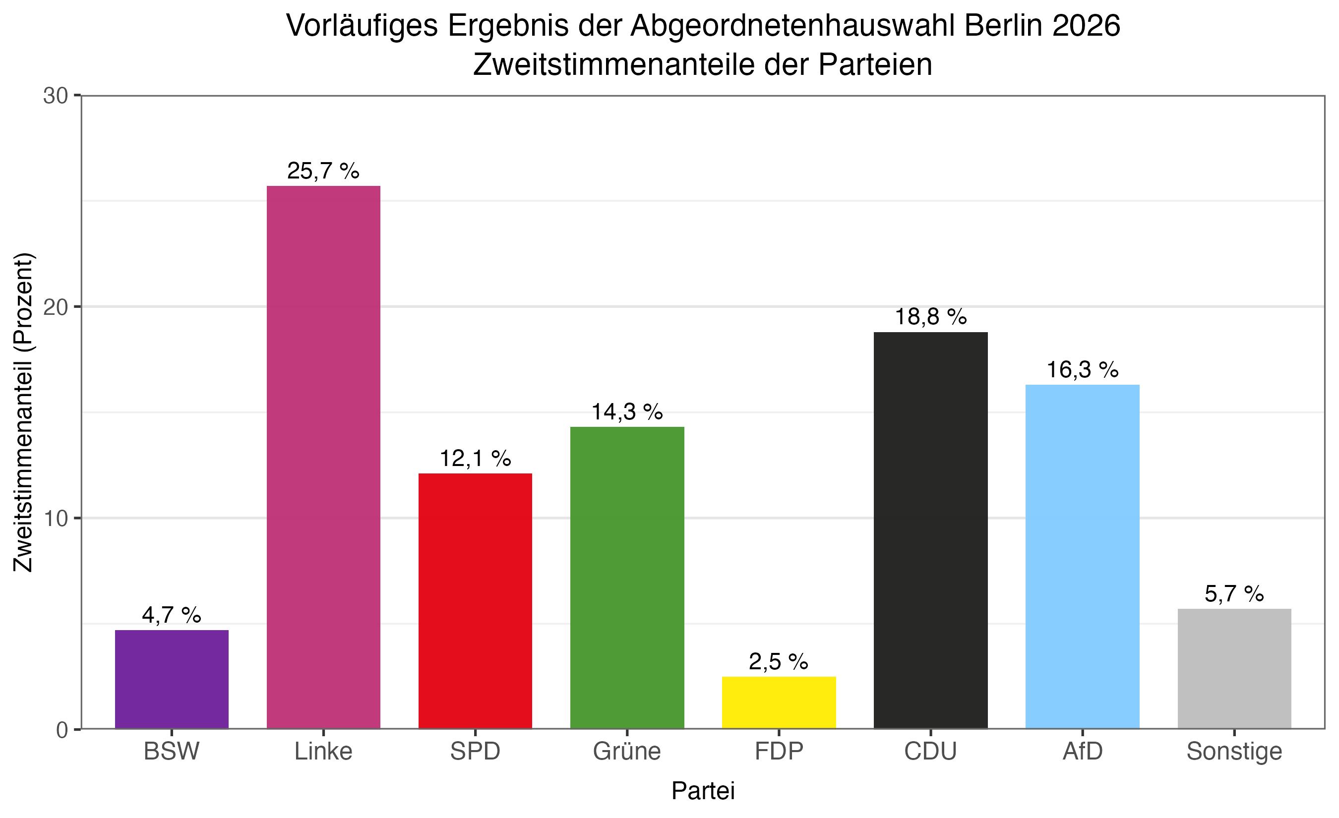
Abgeordnetenhauswahl
Abgeordnetenhauswahl in Berlin
Wie gut lagen die letzten Wahlumfragen und die KOALA-Schätzung im Vergleich zum vorläufigen Wahlergebnis?
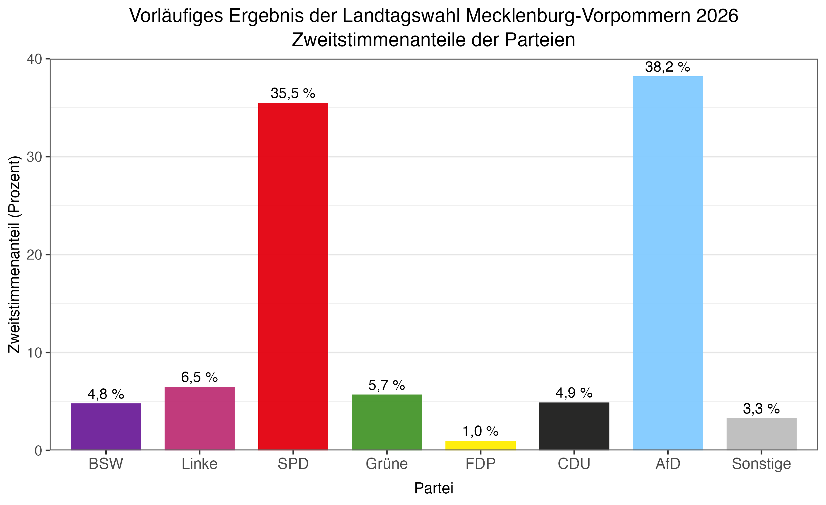
Landtagswahl
Landtagswahl in Mecklenburg-Vorpommern
Wie gut lagen die letzten Wahlumfragen und die KOALA-Schätzung im Vergleich zum vorläufigen Wahlergebnis?
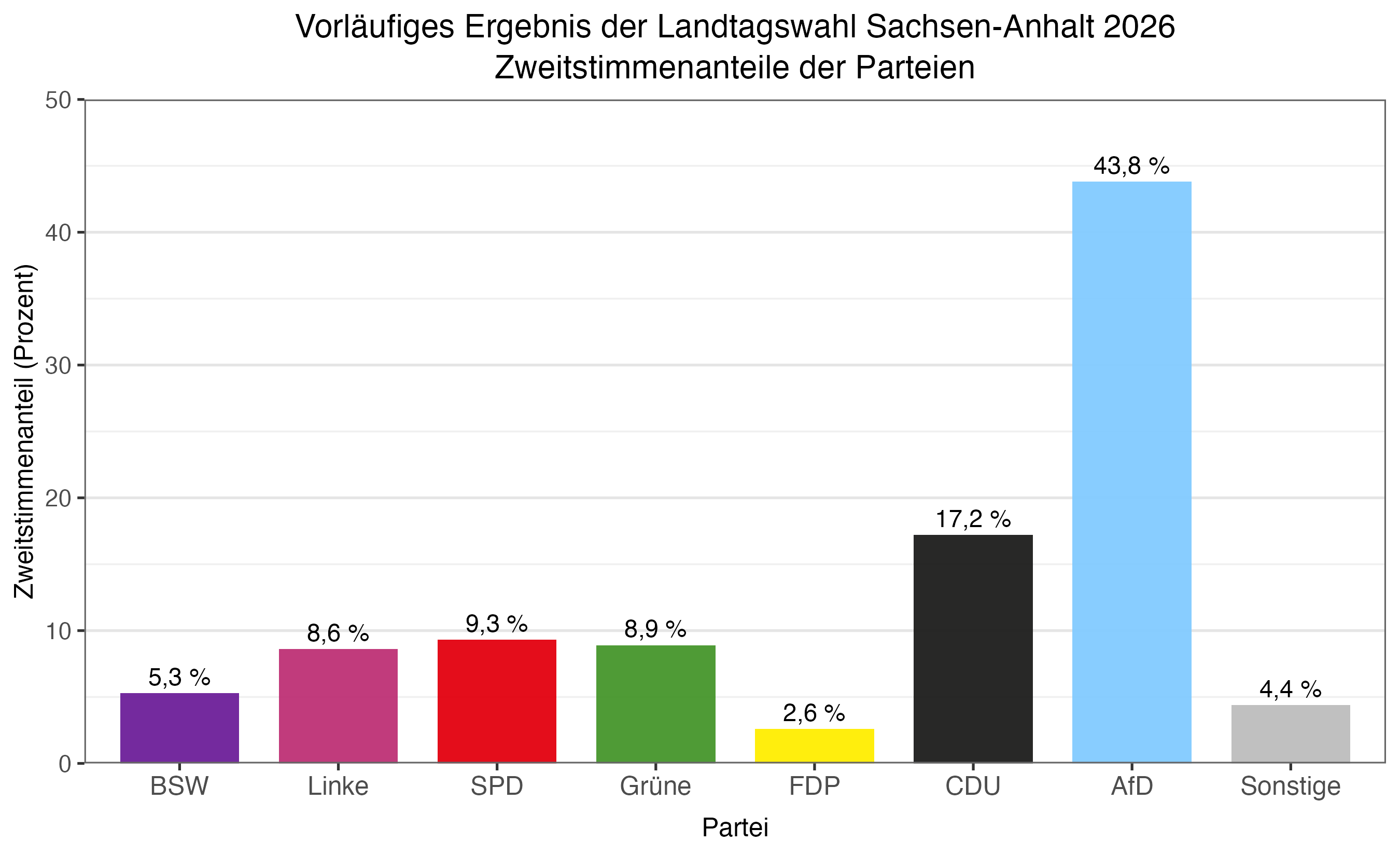
Landtagswahl
Landtagswahl in Sachsen-Anhalt
Wie gut lagen die letzten Wahlumfragen und die KOALA-Schätzung im Vergleich zum vorläufigen Wahlergebnis?
html`
<div class="methodik">
<style>
.methodik {
--ink: #1f2933;
--muted: #6b7280;
--accent: #2b6cb0;
--line: #e2e8f0;
--wash: #f7f9fc;
max-width: 940px;
margin: 0 auto;
padding: 4px 4px 28px;
color: var(--ink);
font-size: 0.95rem;
line-height: 1.65;
}
.methodik h2, .methodik h3 { margin: 0; font-weight: 700; }
.methodik-election {
font-size: 1.5rem;
font-weight: 700;
line-height: 1.25;
margin: 4px 0 0;
}
.methodik-election-date {
color: var(--muted);
font-size: 0.9rem;
margin-top: 3px;
}
.methodik-lede {
color: var(--muted);
margin: 14px 0 0;
}
.methodik-facts {
display: grid;
grid-template-columns: repeat(auto-fit, minmax(150px, 1fr));
gap: 10px;
margin: 20px 0 6px;
}
.methodik-fact {
background: var(--wash);
border: 1px solid var(--line);
border-radius: 8px;
padding: 10px 12px;
}
.methodik-fact-value {
font-size: 1.35rem;
font-weight: 700;
line-height: 1.2;
font-variant-numeric: tabular-nums;
}
.methodik-fact-label {
font-size: 0.76rem;
color: var(--muted);
text-transform: uppercase;
letter-spacing: 0.05em;
margin-top: 2px;
}
.methodik-section { margin-top: 30px; }
.methodik-section > h3 {
font-size: 1.05rem;
padding-bottom: 6px;
border-bottom: 2px solid var(--accent);
display: inline-block;
margin-bottom: 14px;
}
.methodik-steps {
display: grid;
/* Fixed 2x2 rather than auto-fit: with four steps, auto-fit lays out three
across in the 940px container and leaves the fourth orphaned on its own row. */
grid-template-columns: repeat(2, minmax(0, 1fr));
gap: 14px;
}
@media (max-width: 620px) {
.methodik-steps { grid-template-columns: 1fr; }
}
.methodik-step {
position: relative;
border: 1px solid var(--line);
border-top: 3px solid var(--accent);
border-radius: 8px;
padding: 14px 16px 16px;
background: #fff;
}
.methodik-step-num {
display: inline-flex;
align-items: center;
justify-content: center;
width: 26px;
height: 26px;
border-radius: 50%;
background: var(--accent);
color: #fff;
font-size: 0.85rem;
font-weight: 700;
margin-bottom: 8px;
}
.methodik-step h4 { font-size: 0.98rem; font-weight: 700; margin: 0 0 4px; }
.methodik-step p { margin: 0; font-size: 0.89rem; color: var(--muted); }
.methodik-package {
margin: 12px 0 0;
color: var(--muted);
font-size: 0.89rem;
}
.methodik-split {
display: grid;
grid-template-columns: repeat(auto-fit, minmax(280px, 1fr));
gap: 22px;
}
.methodik-institutes { list-style: none; margin: 10px 0 0; padding: 0; }
.methodik-institutes li {
display: flex;
justify-content: space-between;
gap: 12px;
padding: 5px 0;
border-bottom: 1px dashed var(--line);
font-size: 0.9rem;
}
.methodik-institutes li.methodik-institutes-head {
border-bottom: 1px solid var(--line);
font-size: 0.76rem;
color: var(--muted);
text-transform: uppercase;
letter-spacing: 0.05em;
}
.methodik-institutes li span:last-child {
color: var(--muted);
font-variant-numeric: tabular-nums;
white-space: nowrap;
}
.methodik-note {
margin-top: 14px;
background: var(--wash);
border-left: 3px solid var(--accent);
padding: 10px 14px;
font-size: 0.87rem;
color: var(--muted);
}
.methodik-note b { color: var(--accent); }
.methodik a { color: var(--accent); }
</style>
<div class="methodik-election">${cur_meta.title}</div>
<div class="methodik-election-date">Wahltermin: ${cur_meta.next_election}</div>
<p class="methodik-lede">
KOALA übersetzt aktuelle Umfragen in Wahrscheinlichkeiten für Mehrheiten,
Mandatsverteilungen und den Einzug von Parteien. Für die Wahl
<strong>${cur_meta.title}</strong> gilt dabei:
</p>
<div class="methodik-facts">
${[
{ value: cur_meta.seats, label: "Sitze im Parlament" },
{ value: cur_meta.majority, label: "Sitze für die Mehrheit" },
{ value: cur_meta.hurdle, label: "Sperrklausel" },
{ value: "10.000", label: "Simulationen" },
{ value: cur_meta.pooling_days + " Tage", label: "Pooling-Fenster" }
].map(f => html`
<div class="methodik-fact">
<div class="methodik-fact-value">${f.value}</div>
<div class="methodik-fact-label">${f.label}</div>
</div>
`)}
</div>
<div class="methodik-section">
<h3>Der Rechenweg</h3>
<div class="methodik-steps">
${methodik_steps.map((s, i) => html`
<div class="methodik-step">
<div class="methodik-step-num">${i + 1}</div>
<h4>${s.title}</h4>
<p>${s.lead}</p>
</div>
`)}
</div>
<p class="methodik-package">
Die Berechnungen basieren auf dem R-Paket
<a href="https://github.com/adibender/coalitions" target="_blank" rel="noopener noreferrer"><code>coalitions</code></a>
(Bender & Bauer, 2018).
</p>
</div>
<div class="methodik-section methodik-split">
<div>
<h3>Datenbasis</h3>
<p style="margin:0">
Umfragedaten werden über
<a href="https://www.wahlrecht.de" target="_blank">wahlrecht.de</a>
gesammelt. Für die ${cur_meta.title} werden die folgenden Institute
betrachtet:
</p>
<ul class="methodik-institutes">
<li class="methodik-institutes-head">
<span>Institut</span><span>Letzte Umfrage vom</span>
</li>
${methodik_institutes.map(i => html`
<li><span>${i.name}</span><span>${i.date}</span></li>
`)}
</ul>
</div>
<div>
<h3>Wie die Zahlen zu lesen sind</h3>
<p style="margin:0">
Eine Koalitionswahrscheinlichkeit von 60 % heißt: In 6 von 10 simulierten
Wahlausgängen hätte das Bündnis eine Mehrheit — und keine kleinere
Teilkombination daraus schon allein. Ein größeres Bündnis kann deshalb einen
niedrigen Wert haben, obwohl es rechnerisch fast immer reichen würde. Über
das politische Zustandekommen einer Koalition sagt das nichts.
</p>
<div class="methodik-note">
<b>Nicht im Modell:</b> systematische Verzerrungen der Umfragen (House
Effects), strategisches Wählen und Mobilisierung am Wahltag sowie
Besonderheiten des Wahlrechts wie Überhang- und Ausgleichsmandate.
</div>
</div>
</div>
</div>
`html`
<div style="max-width:940px;margin:0 auto;padding:4px;color:#1f2933;font-size:0.9rem;line-height:1.55">
<h3 style="display:inline-block;margin:0 0 12px;padding-bottom:6px;border-bottom:2px solid #2b6cb0;font-size:1.05rem;font-weight:700">
Veröffentlichungen zur Methodik
</h3>
<div style="display:grid;gap:10px">
<div>
Bauer, A., Bender, A., Klima, A. et al. (2020).
<em>KOALA: a new paradigm for election coverage.</em>
AStA Advances in Statistical Analysis, 104, 101–115.
<a href="https://doi.org/10.1007/s10182-019-00352-6" target="_blank" rel="noopener noreferrer">https://doi.org/10.1007/s10182-019-00352-6</a>
</div>
<div>
Bauer, A., Klima, A., Gauß, J., Kümpel, H., Bender, A. & Küchenhoff, H. (2022).
<em>Mundus Vult Decipi, Ergo Decipiatur: Visual Communication of Uncertainty in Election Polls.</em>
PS: Political Science & Politics, 55(1), 102–108.
<a href="https://doi.org/10.1017/S1049096521000950" target="_blank" rel="noopener noreferrer">https://doi.org/10.1017/S1049096521000950</a>
</div>
</div>
</div>
`html`
<div class="projekt">
<style>
.projekt {
--ink: #1f2933;
--muted: #6b7280;
--accent: #2b6cb0;
--line: #e2e8f0;
max-width: 940px;
margin: 0 auto;
padding: 4px 4px 28px;
color: var(--ink);
font-size: 0.95rem;
line-height: 1.65;
}
.projekt a { color: var(--accent); }
.projekt p { margin: 0; }
.projekt-hero { border-bottom: 1px solid var(--line); padding-bottom: 18px; }
.projekt-eyebrow {
text-transform: uppercase;
letter-spacing: 0.09em;
font-size: 0.72rem;
font-weight: 700;
color: var(--accent);
}
.projekt-hero h2 {
font-size: 1.6rem;
line-height: 1.25;
font-weight: 700;
margin: 6px 0 8px;
}
.projekt-lede { color: var(--muted); margin: 0; }
.projekt-section { margin-top: 28px; }
.projekt-section > h3 {
display: inline-block;
margin: 0 0 14px;
padding-bottom: 6px;
border-bottom: 2px solid var(--accent);
font-size: 1.05rem;
font-weight: 700;
}
.projekt-section p + p { margin-top: 12px; }
.projekt-team {
display: grid;
grid-template-columns: repeat(auto-fit, minmax(240px, 1fr));
gap: 14px;
}
.projekt-panel {
padding: 14px 16px;
border: 1px solid var(--line);
border-radius: 8px;
background: #f7f9fc;
}
.projekt-panel h4 {
margin: 0 0 7px;
font-size: 0.95rem;
font-weight: 700;
}
.projekt-names {
display: grid;
grid-template-columns: repeat(2, minmax(0, 1fr));
gap: 3px 18px;
margin: 0;
padding: 0;
list-style: none;
color: var(--muted);
font-size: 0.88rem;
}
@media (max-width: 520px) {
.projekt-names { grid-template-columns: 1fr; }
}
.projekt-legal {
display: grid;
grid-template-columns: repeat(auto-fit, minmax(300px, 1fr));
gap: 18px;
}
.projekt-legal address { margin: 0; font-style: normal; }
.projekt-small { color: var(--muted); font-size: 0.87rem; }
/* Funding acknowledgement: logo beside the funder's mandated wording. Wraps
to stacked on narrow screens so the statement stays readable. */
.projekt-funding {
display: flex;
flex-wrap: wrap;
align-items: center;
gap: 18px 24px;
}
.projekt-funding img {
width: 240px;
max-width: 100%;
height: auto;
flex: 0 0 auto;
}
.projekt-funding-text { flex: 1 1 320px; min-width: 260px; }
</style>
<div class="projekt-hero">
<div class="projekt-eyebrow">Über das Projekt</div>
<h2>Von Umfragewerten zu Koalitionswahrscheinlichkeiten</h2>
<p class="projekt-lede">
KOALA übersetzt aktuelle Umfragen in Wahrscheinlichkeiten für Mehrheiten,
Mandatsverteilungen und den Einzug von Parteien. Nähere Informationen zur
statistischen Methodik sind zu finden unter <a href="#methodik">Methodik</a>.
</p>
</div>
<section class="projekt-section">
<h3>Das Projekt</h3>
<p>
Ausgehend von der Idee, die Unsicherheit von Wahlumfragen verständlich und
für eine sinnvolle Wahlberichterstattung nutzbar zu machen, entstand zur
Bundestagswahl 2013 gemeinsam mit ZEIT ONLINE das Projekt
<a href="https://www.zeit.de/serie/wahlistik" target="_blank" rel="noopener noreferrer">Wahlistik</a>.
Dafür wurde ein statistisches Verfahren entwickelt, das die Wahrscheinlichkeiten
konkreter Wahlausgänge und politischer Mehrheiten quantifiziert. Zur
Bundestagswahl 2017 wurde die Methodik weiterentwickelt. Zugleich bestand
eine Zusammenarbeit mit
<a href="https://pollyvote.de/" target="_blank" rel="noopener noreferrer">PollyVote</a>,
dessen konkrete Vorhersage des Wahlausgangs das KOALA Angebot ergänzte.
</p>
<p>
Für die aktuelle, auf dieser Seite präsentierte Fassung wurde KOALA technisch neu aufgesetzt, die statistische Methodik ist gleich geblieben.
</p>
</section>
<section class="projekt-section">
<h3>Wer wir sind</h3>
<p style="margin-bottom:14px">
Die statistische Methodik und die ursprüngliche Webseite wurden vom
<a href="https://www.stat.lmu.de/stablab/de/" target="_blank" rel="noopener noreferrer">Statistischen Beratungslabor StaBLab</a>
des Instituts für Statistik der LMU München entwickelt. Die neue Fassung ist in Kooperation mit der <a href="https://www.slds.stat.uni-muenchen.de/consulting/" target="_blank" rel="noopener noreferrer">Machine Learning Consulting Unit (MLCU)</a>, die Teil des Instituts für Statistik und <a href="https://mcml.ai/" target="_blank" rel="noopener noreferrer">Munich Center for Machine Learning</a> ist, entstanden.
</p>
<div class="projekt-team">
<div class="projekt-panel">
<h4>Beteiligte der bisherigen Projektentwicklung</h4>
<ul class="projekt-names">
<li>Dr. Alexander Bauer</li>
<li>Dr. Andreas Bender</li>
<li>Dr. Matthias Aßenmacher</li>
<li>Dr. André Klima</li>
<li>Prof. Dr. Helmut Küchenhoff</li>
<li>Jana Gauß</li>
<li>Rebekka Schade</li>
<li>Daniel Schlichting</li>
<li>Helena Veit</li>
</ul>
</div>
<div class="projekt-panel">
<h4>Beteiligte an der Neuaufsetzung</h4>
<ul class="projekt-names">
<li>Alexander Winterstetter</li>
<li>Jakob Haas</li>
<li>Jan Anders</li>
<li>Dr. Andreas Bender</li>
<li>Prof. Dr. Helmut Küchenhoff</li>
</ul>
</div>
</div>
<p style="margin-top:14px">
Fragen zum Projekt beantworten wir gerne. Kontakt unter
<a href="mailto:jan.anders@stat.uni-muenchen.de">jan.anders@stat.uni-muenchen.de</a>.
</p>
</section>
<section class="projekt-section">
<h3>Unser Dank</h3>
<p>
Wir danken
<a href="https://www.zeit.de/autoren/S/Matthias_Stolz/index.xml" target="_blank" rel="noopener noreferrer">Matthias Stolz</a>
von ZEIT ONLINE, von dem die Idee für diese innovative Art der Darstellung
stammt, sowie
Andreas Graefe von PollyVote für wichtige Anregungen und fachlichen Input. Unser Dank gilt
außerdem dem Team von
<a href="https://www.wahlrecht.de" target="_blank" rel="noopener noreferrer">wahlrecht.de</a>
für die zuverlässige und zeitnahe Bereitstellung neuer Umfragedaten.
</p>
</section>
<section class="projekt-section">
<h3>Förderung</h3>
<div class="projekt-funding">
<a href="https://www.berd-nfdi.de/" target="_blank" rel="noopener noreferrer">
<img src="berd-nfdi-logo.svg"
alt="BERD@NFDI – Gefördert durch die Deutsche Forschungsgemeinschaft (DFG)">
</a>
<div class="projekt-funding-text">
<p>
Die Neuaufsetzung von KOALA wird im Rahmen von
<a href="https://www.berd-nfdi.de/" target="_blank" rel="noopener noreferrer">BERD@NFDI</a>
gefördert:
</p>
<p class="projekt-small" style="margin-top:8px">
Funded by the Deutsche Forschungsgemeinschaft (DFG, German Research
Foundation) under the National Research Data Infrastructure –
NFDI 27/1-2026, project number 460037581.
</p>
</div>
</div>
</section>
<section class="projekt-section">
<h3>Datenschutz</h3>
<p>
Dieses Informationsangebot verwendet keine Formulare, setzt selbst
keine Cookies und nutzt keine eigene Reichweitenanalyse. Beim Aufruf werden
technisch erforderliche Verbindungsdaten, insbesondere die IP-Adresse, durch
den Hosting-Dienst GitHub Pages verarbeitet. Für die interaktiven Grafiken
wird die Programmbibliothek D3 über das Content Delivery Network jsDelivr
geladen, dabei erhält auch der CDN-Anbieter technisch erforderliche
Verbindungsdaten.
</p>
<p class="projekt-small">
Weitere Informationen finden Sie in der
<a href="https://www.lmu.de/de/footer/datenschutz/" target="_blank" rel="noopener noreferrer">Datenschutzerklärung der LMU</a>,
den <a href="https://docs.github.com/en/site-policy/privacy-policies/github-general-privacy-statement" target="_blank" rel="noopener noreferrer">Datenschutzhinweisen von GitHub</a>
und der <a href="https://www.jsdelivr.com/terms/privacy-policy" target="_blank" rel="noopener noreferrer">Datenschutzerklärung von jsDelivr</a>.
</p>
</section>
<section class="projekt-section">
<h3>Impressum</h3>
<div class="projekt-legal">
<address>
<strong>Ludwig-Maximilians-Universität München</strong><br>
Geschwister-Scholl-Platz 1<br>
80539 München<br>
Telefon: +49 89 2180-0<br>
E-Mail: <a href="mailto:poststelle@verwaltung.uni-muenchen.de">poststelle@verwaltung.uni-muenchen.de</a>
</address>
<div>
<p>
Die Ludwig-Maximilians-Universität München ist eine staatliche Einrichtung
des Freistaates Bayern und eine rechtsfähige Personalkörperschaft des
öffentlichen Rechts. Sie wird durch ihren Präsidenten gesetzlich vertreten.
</p>
<p class="projekt-small">
Inhaltlicher Kontakt für dieses Angebot: Jan Anders,
<a href="mailto:jan.anders@stat.uni-muenchen.de">jan.anders@stat.uni-muenchen.de</a>.
Vollständige Pflichtangaben, Aufsichtsbehörde und Haftungshinweise enthält das
<a href="https://www.lmu.de/de/footer/impressum/" target="_blank" rel="noopener noreferrer">zentrale Impressum der LMU</a>.
</p>
</div>
</div>
</section>
</div>
`